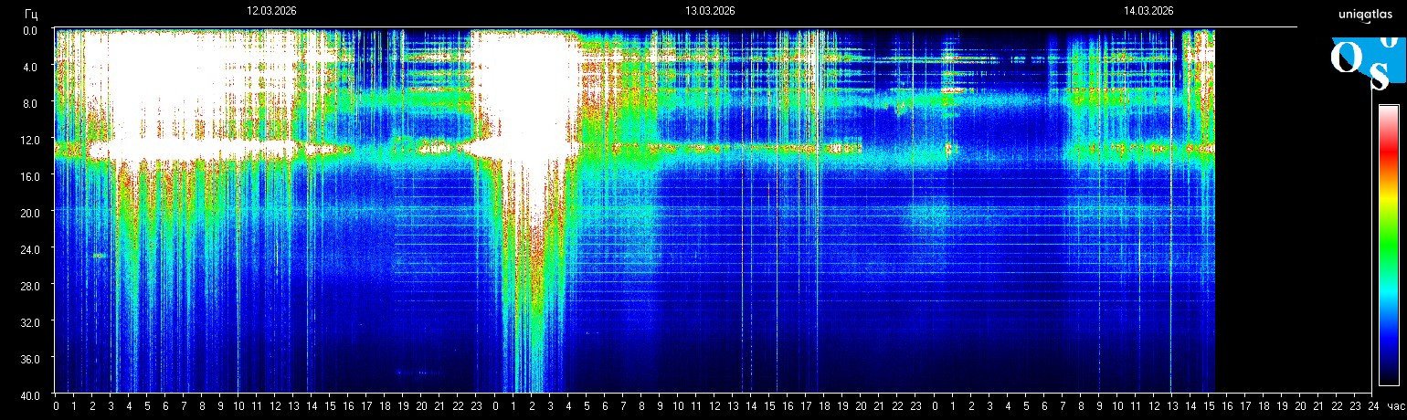
What Can Raise Schumann Resonance Charts? Storms, Noise, Compression, and Station Limits
Catatan bahasa
Halaman ini tetap dalam bahasa Bahasa Indonesia untuk navigasi dan SEO. Di bawah ini ditampilkan ringkasan lokal singkat sementara versi editorial penuh dalam bahasa ini masih diperluas.
Readers often ask what can raise a Schumann chart because a bright panel looks like it should have one simple cause. In practice, there can be more than one driver. Some relate to the monitored environment, while others come from station behavior or image presentation.
Main categories to check
- Environmental pressure that appears across the monitored bands.
- Noise and interference that add irregular lines or local artifacts.
- Compression and display limits that make one section look more dramatic than it really is.
- Station-specific scaling that changes how intensity is visualized.
Why one cause is rarely enough
A chart can look stronger because several factors overlap. That is why the best reading avoids one-cause certainty and starts with “what combination of signal, noise, scale, and timing could explain this frame?”
Best next step
Use the live homepage for the freshest frame, compare it with the today context, and keep the methodology page open while interpreting unusually bright movement.
Stay inside the same topic cluster
Learn how to read charts, spikes, whiteouts, and spectrogram structure without mistaking noise for a real signal.
Buka frame Schumann terbaru di beranda
Beranda terus diperbarui di sekitar spektrogram terbaru, frekuensi saat ini, dan konteks cepat. Buka lebih dulu jika Anda ingin melihat sinyal paling segar sebelum lanjut membaca.
Frekuensi live, frame terbaru, dan konteks singkat ada bersama.
Catatan editorial
Schumann Resonance Live memperlakukan grafik Schumann sebagai data pemantauan lingkungan, bukan diagnosis medis. Untuk batas sumber dan koreksi, lihat Metodologi dan Standar Editorial.